Using the HGM Charts App
Getting Started
If you have saved a logging file from any of the HGM setup apps, you can use the HGM Charts app to review the data. The charts is a progressive web application (PWA) that is loaded through a web browser. Once loaded, the HGM Charts app can be run again without having a connection to the Internet.
You can start the app by opening the web site: charts.hgmelectronics.com. Once you are there, you’ll be presented with a screen that looks like this:
If you are on a desktop platform, you can drag and drop a log file onto the window. On all devices, you can click or tap the LOAD FILE button and then browse on your local device for an HGM log file (has extension .hjl).
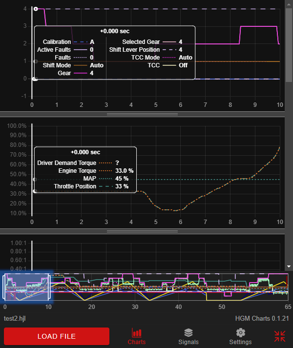
One the file is loaded, you will see the resulting charts, and you can use the scroll bar on the left side to move up and down among the charts. By default, one chart is created for each signal type which minimizes the number of Y axes on the left side.
Navigation and Zoom
You can make any graph bigger vertically by grabbing the divider between the graphs.
You can move ahead and back in time by grabbing the center of the scrubbing slider at the bottom of the window, shown highlighted in blue:
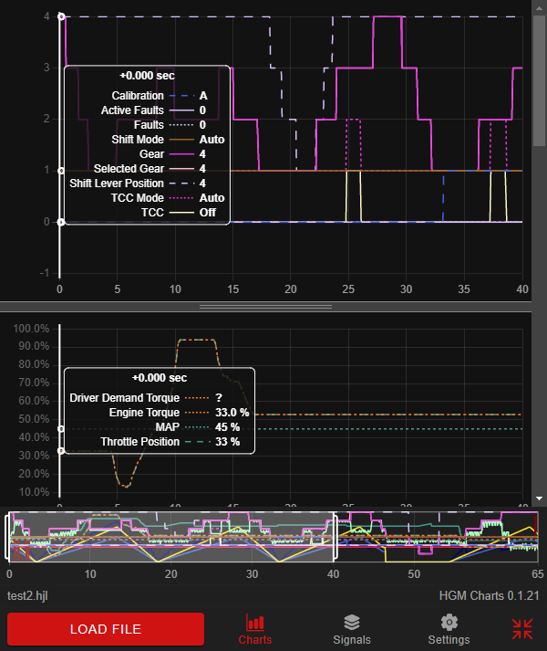
By grabbing either side of the scrub slider, you can widen or narrow the duration of time visible on the graph. The default is 10 seconds. In the view below, the graph has been widened to 40 seconds:
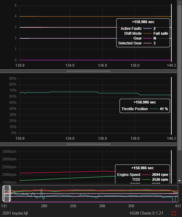
To help with performance when viewing long log files, the app defaults to showing only 5 minutes of data at a time. If you open a file that’s more than 5 minutes long, a second scrub slider will appear, shown highlighted in blue:
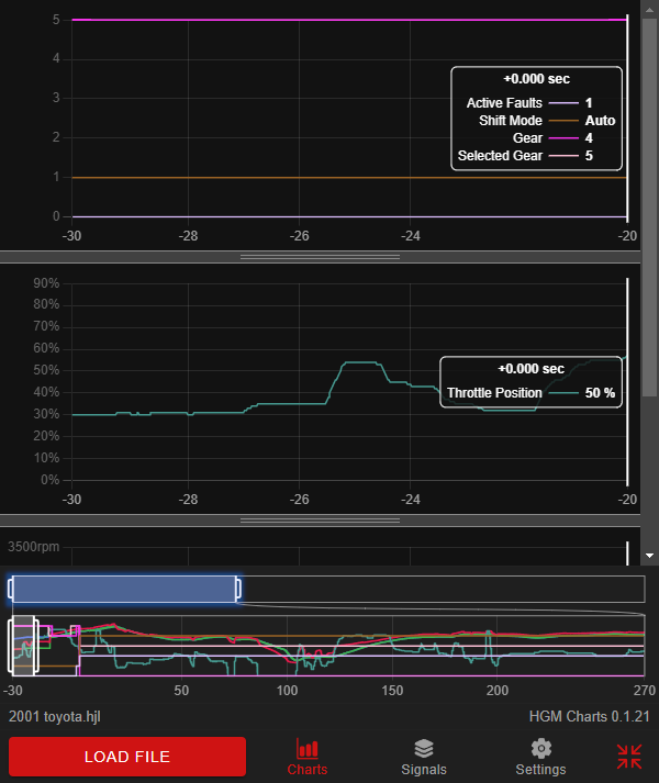
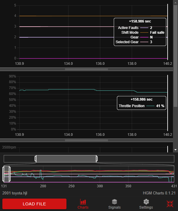
To change the range of data that’s visible in the regular scrub viewfinder, you can move or resize this “coarse” scrub slider in the same way as the regular slider. In the view below, the coarse slider has been moved to reveal data from 131 seconds through 431 seconds.
To save space on smaller screens, you can shrink the bottom tab bar and coarse viewfinder by clicking/tapping the “contract” button at the bottom right. The bottom tab bar and viewfinder will shrink down to nothing, and the “contract” button will change into an “expand” button. To re-expand, click/tap the button again.
Reviewing Values
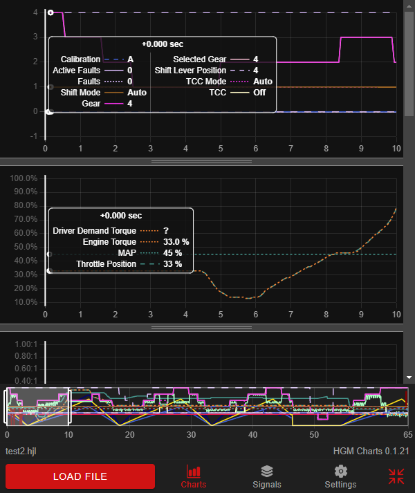
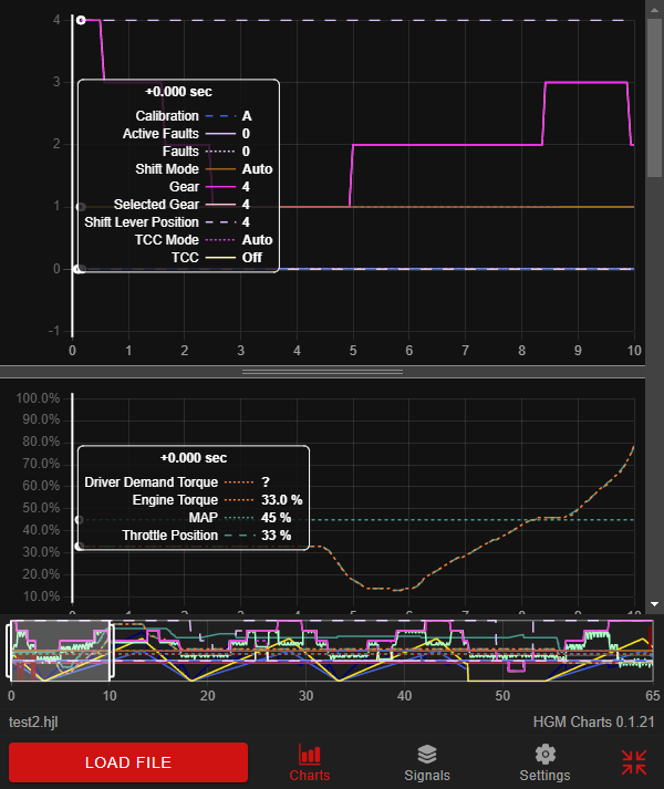
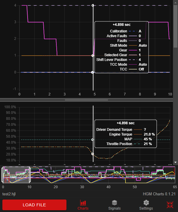
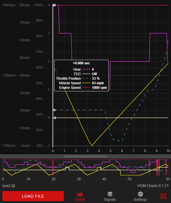
Each graph has a cursor and signal list that shows the value of each signal at the cursor position, as well as the time. You can move the cursor to any convenient location on screen where it will remain fixed. This lets you scroll the graph and review the signal values as they move through the cursor location.
In the view below, you can see that at 4.898 seconds, the Driver Demand Torque is unknown, the Engine Torque is 21.0%, the MAP is 45%, and the Throttle Position is 21%.
Reorganizing the Graphs
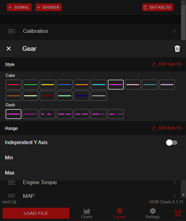
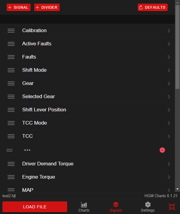
When you first load a log file, all of the signals captured in the log file are shown. You can turn on and off signals shown on the charts, and re-arrange any of them, by clicking on the “Signals” button. This view shows each signal along with the divider between each graphs. You can add signals or dividers using the buttons at the top, or move signals among the graphs by dragging the slider on the left side. Removing a divider joins two graphs together.
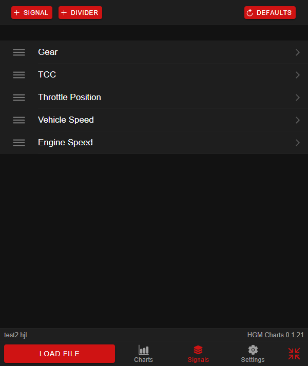
If you move two signals that have different types into the same chart, you will get a Y axis for each one. By default, if two signals have the same type, like % or RPM, then those signals will share a single Y axis in a chart. In the example below, five signals are selected and because there is no divider, only one graph is shown. There are four Y axes: one for RPM, one for vehicle speed, and one for gear and TCC.
You can access more options for signal display by clicking or tapping the signal. To set the color and dash pattern of the line on the chart, click or tap the button showing how you want it to look. Enabling the “Independent Y Axis” option will cause the signal to be shown with its own separate Y axis, even if there are other signals in the same chart with the same type. The Min and Max options can be used to change the range of the Y axis.
If you wish to delete the signal, click/tap the trash can icon. You can always restore it using the “add signal” button.